Product Designer
Fresh Market
Objective: Redesign Fresh Market website - an online fresh fruit and vegetable retail
Role: User research, Interaction and visual design, Wireframing and prototyping, User testing
Client: Niaz Zia Design School
Tools: Figma, Miro, Google Forms, Google Docs.
Duration: 10 weeks
Overview: Fresh Market was an experimental UX/UI project aimed at redesigning a fresh produce e-commerce website for a fictional client within a two-month sprint during a bootcamp. The objective was to practice a user-centric design process, which involved exploratory research, user interviews, competitive analysis, and culminated in the creation of high-fidelity wireframes and prototypes.

Problem Statement
The current Fresh Market website presented challenges for potential shoppers as it lacked ease of use and intuitiveness. Users had to navigate through multiple pages individually to find what they needed, with no straightforward way to refine their search. This case study focuses on improving the discoverability of items on the Fresh Market website, making it easier for users to search for items based on their preferences. The redesign involves creating a new flow and design that allows users to search for items using a search filter, select items, add them to their shopping cart, and proceed to checkout.
User Research
Survey and Interview
To assess the Fresh Market website, I began by observing users as they attempted to complete tasks. While users managed to navigate through the website and complete the checkout process, they encountered difficulties in narrowing down their choices and finding the desired products. Following this, I conducted a survey involving 52 participants and interviewed 5 individuals to gain insights into the target audience's preferences and needs related to online grocery shopping. The research aimed to reduce any potential cognitive bias. Here are the key findings:
The users would like to use so that filter or search they can find the right product without going through all pages.

The users would like to save their shopping list so that they can access to regular items quickly.

The users would like to see organic fruits and vegetable separately so that they can choose from the list quickly.
The users would like to be able to choose delivery time so that they can plan their busy lives.

The users would like to save their checkout information so that don't have to enter it every time they place an order.

The users would like to see related products so that they might be able to shop some other items.

Swot
We also evaluated the website to know its strength and weakness and the areas it can improve.

Focusing on User
To ensure the user remained at the forefront of my design process and to avoid imposing my own opinions and assumptions, I developed a persona based on insights gathered about the target audience. Allow me to introduce Tina Green...
.png)
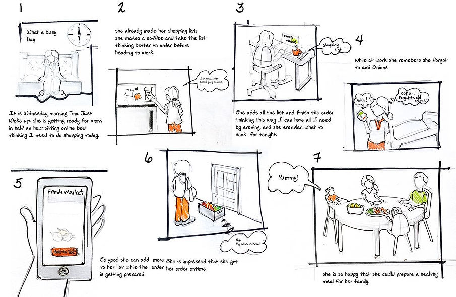
Scenario
Situation: Tina is planning to cook dinner for her family when she comes back from work. she works a full time shift from 6:00AM - 6:00PM today.
Problem: She doesn't have time to go shopping.
Solution: She places an order for the ingredients she needs (and even more) from Fresh Market website during her break.
Outcome: The order is delivered when she is still at work and stays out for a couple of hours! At the end, she is able to make dinner for her family. She is a happy mom(user) with more time on her hands to spend with her family.
Customer Journey Map
Competitor analysis and user research provided insights into the various touchpoints users have with the product. To visualize these insights, I created a customer journey map that depicts the user's experience from browsing the website to receiving the order. This exercise enhanced my understanding and empathy towards the user, enabling me to design a better user experience.

User Flow Chart
Prior to designing wireframes, I focused on illustrating the user flow. This allowed me to understand how users navigate the website and identify any potential complications. As depicted in the "As Is" user flow, finding products was solely possible by browsing through various pages of the website, which proved to be a time-consuming and inconvenient process.


Low-Fi and Mid-Fi Wireframes
I started with sketches but transitioned quickly to mid-fidelity wireframes due to time constraints.


Style Guide
As Fresh Market didn't have any specific guidelines or branding, I created a style guide with the assistance of a mood board to maintain consistency throughout.

Final Design
After incorporating numerous iterations based on user feedback, the final design began to emerge.
.png)
Prototype
Retrospective
This was my first UX/UI design project, and I couldn't believe how far I've come. Although I was able to significantly improve the website's clarity and flow, I believe there is always room for improvement. For future reference:
-
Unfortunately, the original Fresh Market website is no longer available. I should have taken more photos to clearly highlight the changes I made.
-
Relevant and accurate questions in interviews and surveys helped steer the project in the right direction and prevent unnecessary iterations.
-
I can't emphasize enough the importance of timely user testing. I did what I could considering the provided timeline and quarantine constraints. However, postponing it until the visual design stage had a tremendous impact on the project delivery.
-
Since Fresh Market is a website that can be used in everyday life by anyone, it can benefit from features like voice search to make it easier for users to find the products they want. Additionally, accessibility is something that must be considered.